Australia’s leading UX and UI design agency – innovative web and mobile strategy that helps you achieve your goals.
Innovative design services to help you achieve your goals. Our custom design services leverage user research, the latest UX principles, and best practices. Our team of expert designers and developers work closely with you to deliver digital solutions and experiences that keep your customers engaged. Our strategy and design services include:

Digital Strategy
We specialise in helping you to diagnose your current state, document your desired state and identify the best path forward. Our digital consulting services help you plan your technology roadmaps to achieve your digital goals. We help you challenge the status quo and investigate what will drive return on investment.
User Experience Design
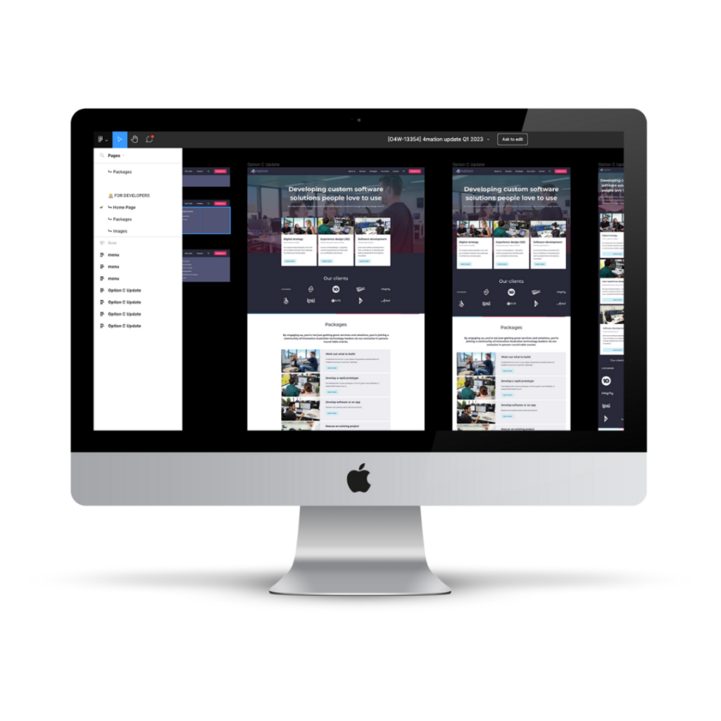
Whether it’s a basic website or custom scalable enterprise software, our UX design services turn your vision into reality. Our proven process starts with research and discovery, ideation, prototyping and testing, then moves to consistent refinement through each iteration. Our user-centric approach helps deliver seamless, intuitive experiences that keep your users coming back.
User Interface Design
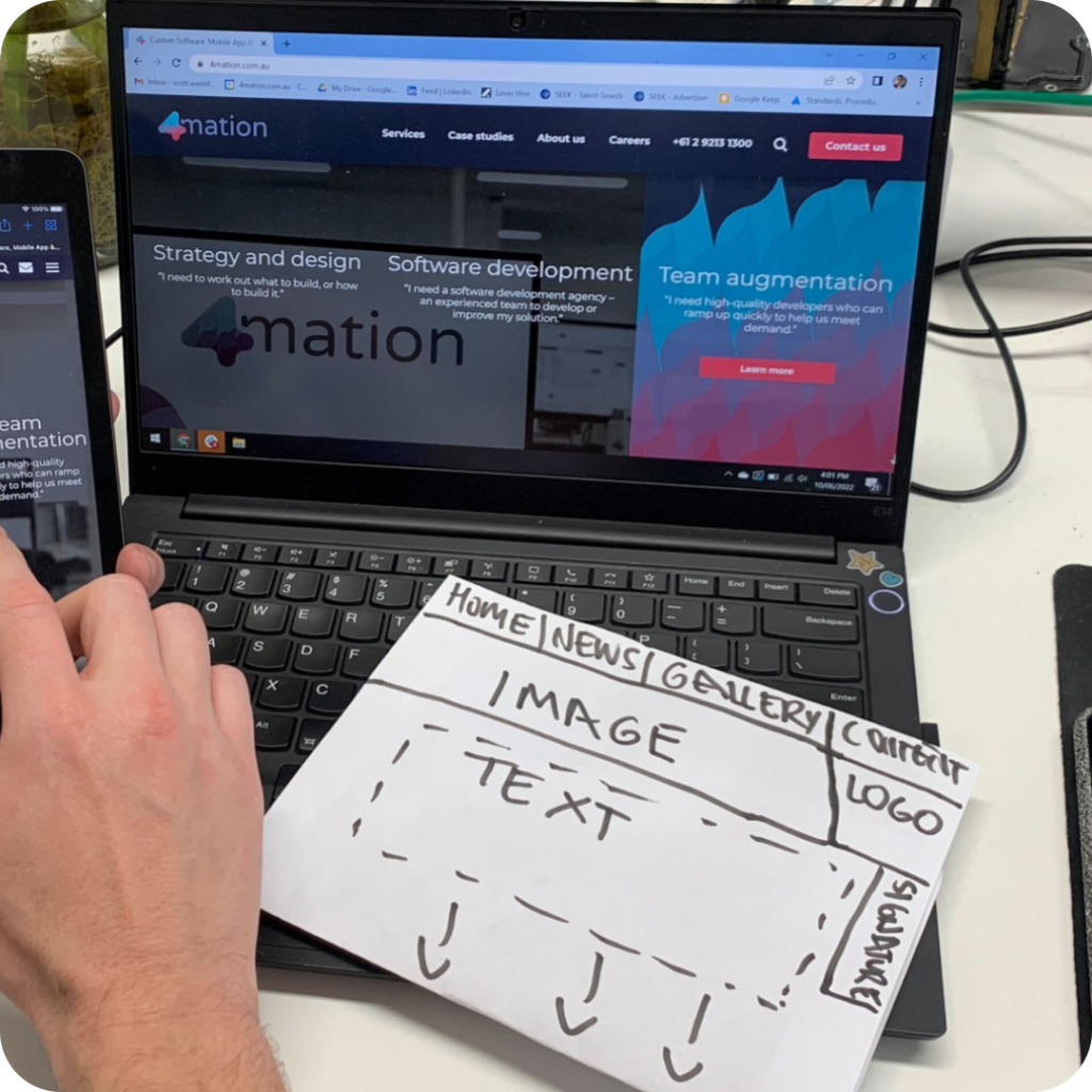
We specialise in building beautiful and functional interfaces for web and mobile solutions. Our UI design services follow a refined process of wireframing and prototyping aligned with user requirements to develop intuitive interfaces that fit the product and brand.
Mobile App Design
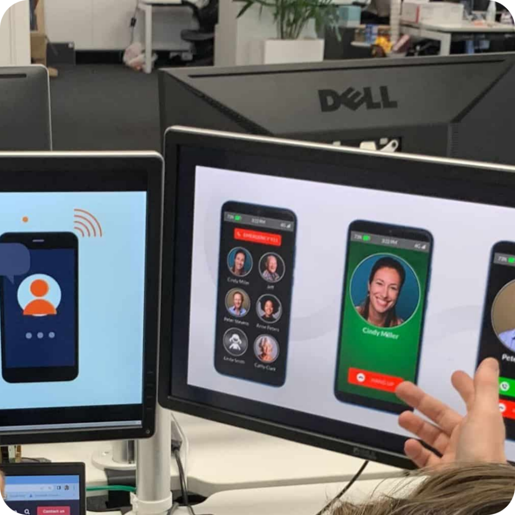
Our mobile app design solutions are tailored to your unique needs. Our user-centric approach to custom iOS, Android & cross-platform development follows a process of research, wireframing, prototyping, and testing to deliver digital experiences your customers will love.
Solution Design
Understand how to win in your space and design a winning solution, with fresh ideas and insights to achieve your project or business goals.

Rapid Prototype
Develop a prototype or MVP that gets you to market faster, enabling user feedback and stakeholder/investor buy-in.
