The Death of the Desktop: The Future For Mobile SEO
Sally YauMarketing Coordinator

Mobile web with desktop search usage is in slow decline in favour of mobile search. Google reported on average, more than 1/4 of all users only use a smartphone, nearly 2X as many as those who only use a computer.
However, it’s 2015 that became the moment for Google to move their focus to a mobile-first user experience. What happened? Well, 2015 was the year that mobile search officially overtook desktop on Google.
With the next pivotal moment coming to Google in the form of the Mobile-first index, I felt it appropriate to look at what’s happened in the past and what’s coming in the future.
The contents of this article were presented at the Sydney SEO Meetup in December 2017. I have adapted them to a comprehensive blog article with plenty of actionable advice.
Indexing for Mobile
To get found in the Google mobile search results, you will need to get your mobile presence into the Google index. Here are the following ways you can do this:
Mobile Subdomain
Serves different code to each device, and on separate URLs. The mobile version is also commonly known as an “M dot” site, with the URL structure being something along the lines of m.example.com.
The mobile subdomain configuration tries to detect the user’s’ device. It then redirects to the appropriate page using HTTP redirects along with the Vary HTTP header.
Dynamic Serving
This configuration uses the same URL regardless of device. However, the server generates a different version of HTML code for different device types based on what the server knows about the user’s browser.
Responsive Web Design
Responsive design is Google’s recommended design pattern. This approach serves the same HTML code on the same URL regardless of the users’ device (desktop, tablet, mobile, non-visual browser). However, the page adapts to each display differently and “responds” depending on the screen size.
Application Indexing
Google App Indexing is a system that allows searchers to click on listings in Google’s search results, also taking them into apps on their Android and iOS smartphones and tablets.
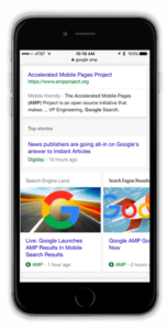
Accelerated Mobile Pages
Accelerated Mobile Pages (AMP), is a Google-backed project intended as an open standard for any publisher to have pages load quickly on mobile devices.
Google’s past Mobile Updates (2014 – Now)
Application Indexing
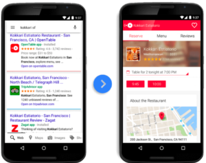
App indexing was added to Google search results on the 25th June 2014. Through App Indexing, you can engage your app users by assisting them to find public and personal content on their mobile device. Moreover, for users who don’t have your App, relevant queries can trigger app installation prompts right from the Google search results.
Key Capabilities of App Indexing
Search Results
App indexing provides links to app content on Google Search. For Android devices, this includes an install button for your app and personal content results in the Google app.
Installs
The install button for your app appears next to your homepage search result. Tproviding users with an easy path to installing your app to view content.
Autocompletion
App Indexing on Android lets your users see app content directly from suggested results in the Google app.
Assistant
App Indexing powers public content results for screen search on Android and Google Assistant on Pixel and Allo.
Ad Targeting
If you use AdMob by Google to monetise your app, App Indexing and AdMob will work together to improve the quality of targeted ads for public content in your app, helping to drive increased advertising revenue.
App Links
Deep Links
Mobile deep linking uses a uniform resource identifier (URI) that links to a specific location in a mobile app instead of simply just launching the app. Moreover, Deferred Deep Linking allows you to deep link to content even if the app isn’t already installed. It’s important to keep in mind that on another mobile device platform, the URI required to trigger the app may be different.
Unlike the Web, where the underlying technology of HTTP and URLs allow for deep linking by default, enabling deep linking on mobile apps requires these apps be configured to properly handle a uniform resource identifier (URI).
Just like a URL is an address for a website, a URI is an address for an app on a mobile device. Examples of URIs that launch a mobile app:
- twitter:// is the iOS URI to launch Twitter’s mobile app
- YouTube:// is the iOS URI to launch YouTube’s mobile app
Universal Links
If you have a website that shares the same content as your iOS app, then you can connect them using universal links. Since iOS 9 Apple has allowed developers to seamlessly link their webpage content even if the app isn’t installed on the device.
Universal links take a URL e.g. HTTP or HTTPS, usually, this URL would open in a browser on the desktop. However, if the user was on a mobile device and clicked on the link, it would open up a deep link to the mobile application.
App Indexing Implementation
This not a comprehensive guide on App Indexing, more a brief overview to show that it can be achieved without a huge investment. To get your app indexed there are three main steps that you need to complete:
- Support HTTP deep links in your mobile app. For iOS, you can do this by setting up support for Universal Links within your application.
Note: After this step, you are able to register your app with Google, and associate it with your website and stop there. Provided you are using the same URLs for your web pages and your app content, Google is able to automatically crawl, index, and attempt to rank your app content based on your website’s structure.
However, explicitly mapping your web pages to your app content using on-page markup provides some additional benefits and allow for a bit more control. Therefore, it’s recommended to follow the full process. - Implement Google App Indexing using the App Indexing API for Android, or by integrating the App Indexing SDK for iOS 9.
- Explicitly map your web pages to their corresponding app screens using either a rel=alternate link element on the individual page, by referencing the app URLs in your XML sitemaps, or by using Schema.org markup.
How to Reference App Links
Option 1: Link rel=alternate element
To add an app link reference to a single page, you can use an HTML <link> element in the <head> of the pages’ HTML code.
<head>
…
<link rel=”alternate” href=”4mation-android-app://com.4mation.android/http/4mation.com.au/example” />
<link rel=”alternate” href=”4mation-ios-app://123456/http/4mation/example” />
…
</head>
<body> … </body>
Option 2: Schema.org markup (Android only)
If you have an Android app, you can use schema.org markup for the ViewAction potential action on an individual page to reference the corresponding app link.
{
“@context”: “<a href=”http://schema.org”>http://schema.org</a>”,
“@type”: “WebPage”,
“@id”: “<a href=”/example”> /example</a>”,
“potentialAction”: {
“@type”: “ViewAction”,
“target”: “4mation-android-app://com.4mation.android/http/4mation.com.au/example”
}
}
</script>
Option 3: Add app deep links to XML sitemap
Rather than marking up individual pages, you can use an <xhtml:link> element in your XML sitemap, inside the <url> element specifying the relevant webpage.
<urlset xmlns=”http://www.sitemaps.org/schemas/sitemap/0.9″ xmlns:xhtml=”http://www.w3.org/1999/xhtml”>
<url>
<loc>http://4mation.com.au/example</loc>
<xhtml:link rel=”alternate” href=”4mation-ios-app://123456/http/4mation/example” />
<xhtml:link rel=”alternate” href=”4mation-android-app://com.4mation.android/http/4mation.com.au/example” />
</url>
…
</urlset>
Ideally, implementing both option 1 and 3 would provide Google with a better chance to index your content correctly.
Google Mobile-friendly Update
The 21st of April 2015 will forever be known in SEO circles as Mobilegeddon. This was the day that Google announced they would roll out the Google Mobile-friendly update.
Essentially, websites that passed the Google Mobile-friendly test were given a boost in ranking in Google mobile search results. Google also provided a tool to test the mobile-friendly conditions. The Mobile-Friendly Testing tool helps identify the following usability errors:
- Flash usage
- Viewport not configured
- Fixed-width viewport
- Content not sized to viewport
- Small font size
- Touch elements too close
These conditions are explained in further details on this Google webmasters support article.
Accelerated Mobile Pages (AMP)
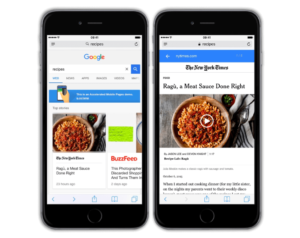
On 24th February 2016, Google added Accelerated Mobile Pages to its search results. It aimed to dramatically improve the performance of the open mobile web by providing a new publisher template optimised for speed and predictability.
At its core, AMP consists of three layers:
AMP HTML — a stripped-down version of HTML that adds restrictions that help ensure reliable and faster performance. While most tags in an AMP HTML page are standard HTML tags, some have been replaced with AMP-specific tags built for site speed optimisation.
AMP JavaScript library — a library for managing resource loading that offers access to the custom AMP HTML tags and works within AMP’s prescribed best-performance practices to help optimise and accelerate page rendering.
AMP Cache — a proxy-based network for delivering AMP documents that fetches AMP HTML pages, and then caches them to improve page performance. It also features a built-in validation system that confirms that the AMP page will work properly without relying on external resources.
Why AMP?
Over 2 Billion AMP Pages
Facebook Instant Articles
Recently, Facebook introduced an extension to the open source Software Development Kit (SDK) used to build Instant Articles; the SDK will now also build content publishable as Google AMP and, soon, Apple News articles.
AMP Icon on Search Listings
Mobile search users will see search results with the AMP lightning bolt logo, indicating the content is available in the mobile format — comparable to the “mobile-friendly” label.
Top Stories (AMP) Carousel
For the most part, when a user searches for news items, Google will often show a carousel that highlights stories from AMP-enabled sites. This carousel is pretty much the same as the one you’ve likely already seen for searches that trigger Google’s Twitter results carousel. The difference here, though, is that when you click on one of these links, the page loads almost instantly.
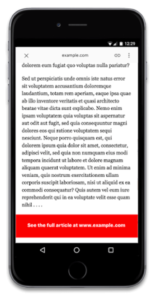
Intrusive Interstitial Penalty

Starting 10th January 2017, Google began enforcing its Intrusive Interstitial Penalty. The Intrusive Interstitial Penalty is aimed at pages where content is not easily accessible to a user on the transition from the mobile search results, due to the use of interstitials or pop-ups.
Google released an article explaining the research behind their decision. However, the bottom line is that obstructing content on mobile with ads or other pop-ups is against Google’s guidelines.
What Is an Intrusive Interstitial?

Google explained which types of interstitials are going to be problematic, including:
- Showing a pop-up that covers the main content, either immediately after the user navigates to a page from the search results, or while they are looking through the page.
- Displaying a standalone interstitial that the user has to dismiss before accessing the main content.
- Using a layout where the above-the-fold portion of the page appears similar to a standalone interstitial, but the original content has been inlined underneath the fold.
Google listed three types of interstitials that “would not be affected by the new signal” if “used responsibly.” Those types are:
- Interstitials that appear to be in response to a legal obligation, such as for cookie usage or for age verification.
- Login dialogues on sites where content is not publicly indexable. For example, this would include private content such as email or unindexable content that sits behind a paywall.
- Banners that use a reasonable amount of screen space and are easily dismissible. For example, the app install banners provided by Safari and Chrome are examples of banners that use a reasonable amount of screen space.
The official guidelines provided by Google are pretty vague at times. The company’s definition of what constitutes an intrusive interstitial is not clear-cut and many elements are not addressed, such as:
- Sticky sidebars,
- Share buttons,
- Live chat boxes,
- Coupon popups.
The Future of Mobile Search
Mobile-first index
There is all indication that the mobile-first index will be fully rolled out in 2018. This is supported by various statements made by Google over the past year. Including most recently with Webmaster Trends Analyst, Gary Illyes telling his audience at SMX East in October, that the mobile-first index had started to slowly roll out, at least for a “few sites”.
Currently, when users search for something on their mobile using the Google search engine, Google uses a desktop-based index to deliver results. Its ranking system then typically looks at the desktop version to evaluate its relevance to the user’s query.
Once the mobile-first update has completed its rollout, the opposite will be the case. Meaning your desktop site will be indexed and ranked based on the mobile version of the index!
No Mobile Site
There is a bit of a caveat for those with absolutely no mobile site. With Google saying “If you only have a desktop site, they’ll continue to index your desktop site just fine”.
Of course, these websites are already suffering from the 2015 Google mobile-friendly update as their pages aren’t deemed mobile-friendly.
For a comprehensive guide to your options and how to prepare your site. Check out my recent blog post on Google’s mobile-first index and how to save your website.
AMP Bait & Switch: Update
Google recently announced that as of 1st February 2018, AMP pages that have content uncomparable to the (original) non-AMP pages, Google will no longer display the AMP listing.
Why is Google doing this? In a small number of cases, AMP pages are used as teaser pages. Twhich create a particularly bad user experience since they only contain minimal content.
When Google finds an AMP page that doesn’t have the same critical content as its non-AMP equivalent, they will direct users to the non-AMP page. The change, however, does not affect Search ranking. Although these pages will not be considered for Search features that require AMP, such as the Top Stories carousel with AMP.
Google has said they will notify the webmaster via Search Console with a manual action message and give them an opportunity to fix the issue before their AMP pages can be served again.
AMP for eCommerce
Having a passion for eCommerce, I am personally very excited about the application of AMP for eCommerce. Over the last year, the AMP project has been adding heaps of additional beta features to allow for an immersive eCommerce experience across multiple page types.
Product Pages
It’s possible with AMP to create beautiful and interactive product pages. There is a large variety of libraries such as amp-carousel, amp-video, amp-accordion, amp-social-share, amp-sidebar and amp-list which can be used to create full-featured product pages.
For product pages, the introduction of the much-anticipated amp-bind makes it possible to create truly interactive AMP pages. Amp-bind can be used to coordinate page state based on user interaction to show and hide arbitrary divs. This makes tabs, colour swatches and dynamic pricing achievable for eCommerce stores.
Product Category Page
Product category pages are popular search landing pages. AMP now provides the ability to bring dynamic elements such as product listings or search to a mix of editorial content.
Personalisation and Login
amp-list provides an easy way to serve up personalised content to your users. You can achieve this either using cookies (using the attribute credentials=”include”) or AMP’s client id.
Checkout Flow and Payments
To avoid user frustration, AMP makes it possible for users to initiate checkout directly from within your AMP pages. Here are three ways to handle the checkout in AMP pages:
- Using Google Chrome, you can use the Payments Requests API with AMP. Providing an almost frictionless payment experience. Check out this payments sample to see how it works.
- Implement your checkout flow inside your AMP pages using amp-form.
- Redirect users to the checkout flow on your website. It’s important however that you make the transition as seamless as possible, in particular, don’t make users enter the same information twice.
Analytics
Amp-analytics allows you to measure how users engage with your AMP Pages. However, there are limited eCommerce capabilities at this point. In addition, you can you can also use amp-call-tracking dynamically replace a phone number in a hyperlink to enable call tracking.
Progressive Web Apps (PWAs)
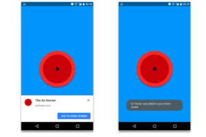
Progressive Web Apps are installable websites that live on the user’s home screen, without the need for an app store.
Add to Home Screen
If the Progressive Web App criteria are met, Chrome on Android prompts users to add the Progressive Web App to their home screen.
Work Offline
When launched from the home screen, service workers enable Progressive Web Apps to load instantly, regardless of the network state.
Written in JavaScript, a service worker is like a client-side proxy and puts you in control of the cache and how to respond to resource requests. By pre-caching key resources, you can eliminate the dependence on the network, ensuring an instant and reliable experience for your users.
Push Notifications
Progressive Web Apps offer an immersive full-screen experience with help from a web app manifest file and can even re-engage users with web push notifications.
The Web App Manifest allows you to control how your app appears and how it’s launched. You can specify home screen icons, the page to load when the app is launched, screen orientation, and even whether or not to show the browser bar.
Combine AMP with Progressive Web Apps
Most websites will never need to achieve anything beyond the boundaries of AMP. However for those that do there is an ability to combine AMP with PWAs.
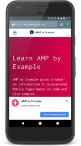
AMPbyExample is a great site to find code snippets that make it easier to implement AMP components. It is also both AMP and a Progressive Web App:
- AMPbyExample has a Web App Manifest, prompting the “Add to Homescreen” banner.
- AMPbyExample also has a Service Worker and, therefore, allows offline access, among other things.
When a user visits AMPbyExample from an AMP-supporting platform and then clicks continues the onward journey onto the same site, they navigate away from the AMP Cache to the origin. The website still uses the AMP library, of course, but because it now lives on the origin, it can use a service worker, can prompt to install and so on.
Note: The Service Worker won’t be able to interact with the AMP-cached version of your page. Use it for onward journeys to your origin.
Voice Search
Dramatic Rise in Digital Assistants
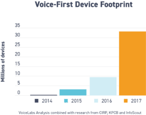
In 2017 the amount of voice-first devices was predicted to be circulation was over 33 million. This is more than three times the amount in circulation in the last year.
Voice Search Isn’t Going Anywhere
As voice search continues to grow, it will rival or even possibly overtake text search. In fact, ComScore says that by 2020, 50 percent of all searches will be voice searches.
Over a Quarter of Bing Searches Are Voice-Based
At Bing voice searches are becoming an important part of their search engine’s usage. In May 2016 Search Engine Journal reported, Bing representatives were stating that 25% of all searches conducted through the Windows 10 taskbar were voice-based. This number is more than likely much higher now given voice search’s increasing popularity.
Bing Powers More Voice Technology Than Google
Surprisingly, in 2016 Bing had an edge over Google for voice search. However, when you consider the platforms that utilise it, it begins to make sense. Three of the four major virtual assistants on the market – Microsoft’s Cortana, Amazon’s Alexa and Apple’s Siri (However, not for much longer) – use Bing for their searches. This leaves Google to power the Google Assistant, only featured on the Google Home and Pixel Devices.
Virtual Assistants Still Have Improving to Do
The technology behind voice has gotten far better over the last 10+ years. But there is still a lot of work to do, with tech companies in a race to perfect it. Former chief scientist at Baidu, Andrew Ng, has said that voice search will really take off when accuracy gets to 99% or better. Stating none of the four major virtual assistants has reached that level of accuracy yet, but all of them are getting close.
How Can You Leverage Voice Search?
Claim Your Google My Business Listing
For those of you who haven’t claimed their Google My Business listing, stop everything you’re doing and get it done right now!
Claiming and optimising your Google My Business listing is a fantastic way for Google to find out more information about your business. This includes the business category you’re in, your phone number, address, business hours and more.
Also, since many voice searches are local in nature, having your Google My Business listing claimed and updated can help to increase your chances of showing up when a voice search is related to your local business, business category or location.
Conversational Keywords
With voice search, keywords are what some SEOs refer to as long-tail+. The idea behind “plus” is to refer to conversational phrases that are added when optimising for conversational voice search.
This means your keyword strategy needs to be more conversational in nature and mimic how real people talk and ask questions verbally.
A great exercise is to start thinking about the sorts of questions your customers ask about your business on the phone or in person, then start documenting and recording the exact words they use.
Then you can start creating content pages that focus on those longer, more conversational search terms.
Frequently Asked Questions (FAQ) pages
Once you have this information you can use this customer data to create FAQ pages that focus on the long-tail+ conversational keyword phrases.
Go for natural-sounding questions and phrases instead of the old SEO-keyword phrases you’re probably used to using. Also, group common questions on the same page while creating several different pages for different phrases giving voice search technologies a better chance of pulling information from your site.
Searches such as “best video camera” will start to disappear, and hyper-specific searches will become more popular.
Example: “Ok Google, where can I find a waterproof video camera that works with Facebook Live?”
The goal is always to offer quick, succinct answers to questions that voice searchers are asking.
It can seem like a big task, but creating these individual pages and snippets of content centred around specific semantic questions people are asking can not only help your site show up in voice search results, it can also increase your chances of appearing in a Google “Featured Snippet.”
Structured Data Markup
Finally, use structured data markup to give these voice search devices more context. Structured data markup from Schema.org is crucial for your Google understanding more about your site. Schema markup defines more specific information and makes it easier for search engines to accurately parse your content and understand its context.
TL;DR
It’s clear mobile is here to stay and will continue to grow for the foreseeable future. As this is quite a long article and presentation here are the key takeaways for your business:
- If you’re not on mobile you’re losing visitors.
- Get your app indexed.
- Check your website is mobile-friendly.
- Consider Accelerated Mobile Pages (AMP).
- Remove intrusive interstitials!
- Prepare for the mobile-first index.
- Don’t bait and switch on AMP.
- Consider Progressive Web Apps (PWAs).
- Get ready for voice search.
- Get a responsive site!
About The Author
