Don’t Let Design Weigh Down Your Website Performance
Scott MorrisHead of Engineering
Having been with 4mation since inception in 2001 while completing a Computer Science degree at UTS, Scott has played a variety of roles within the business through its almost 20 years of growth.
As a Certified AWS Solutions Architect, Scott has a strong ability to bridge the gap between the technical and business/user world. Scott has a deep understanding of the service we provide our clients having spent years as a Developer, Business Analyst, Team Lead, and Head of Delivery.
His focus now is heading up 4mation’s Internal Operations to make our work and suite of digital tools as efficient and effective as possible.

Could your graphic assets and images be weighing your page speed down?
Since 2011, the average web page weight (size in bytes of assets being served) on mobile has increased by more than 500% to almost 2mb. Given that connection speeds haven’t improved at the same rate, this is having a detrimental effect on website load time.
A Google poll revealed that the #1 frustration users had when browsing on their mobile device was slow load time with 60% expecting a page to load in 3 seconds and a whopping 75% abandoning after 5 seconds.
Having seen the massive impact performance and page speed can have on a site or application it is no longer enough to treat speed optimisation as something that is only considered at the end of a product or feature’s development.
Website performance needs to be a design consideration at all stages of the development lifecycle, whether it is considering what sort of connections speeds users have during the research phase, having a budget during the UI design phase or optimising CSS files during the UI development phase. If every member of the team understands the importance of performance, you will improve page load times, the user experience, conversion rates and, importantly the bottom line.

Page Weight
Deciding on targets and benchmarks for our page weight is the first step to improving performance. In terms of load time, a good benchmark to aim for is to load 20% faster than your fastest competitor. This can in turn translate to a 20% lighter page weight but a good rule of thumb is to keep your assets under 1mb.
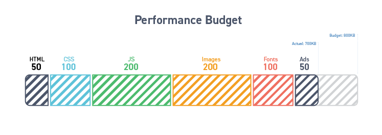
Performance Budgets
An effective approach to keeping the final page weight as low as possible is to set a ‘performance budget’. This involves setting a benchmark for page weight early in the project and making sure that we keep the total size of the assets being loaded below that.
So for example, the designer might limit themselves to 200kb for images and 150kb for fonts. This will involve them making decisions on image compression and quality as well as the number of fonts within a typeface to use. Working closely with the developer to make these decisions is a vital part of performance budgeting.
Images
Images tend to be the biggest contributor to page weight and load time. There are a lot of ways we can reduce the footprint of these assets with image optimisation tools like TinyPNG and TinyJPG, the export features of photoshop, some image optimisation plugins for sketch as well as many gulp packages. Though the best way to avoid adding page weight through images is to consider whether or not they are essential to the design.

Use Images Sparingly
The fastest loaded asset is the one that is never sent – so we must consider whether the use of an image is essential or whether the same message could be conveyed with an icon or even some well written copy. Huge images can be very impactful and can come and go in terms of design trends but it is all about striking the right balance between conveying the message and site performance. After all, the message won’t be heard if no one sticks around long enough to hear it.
Choose The Right File Type
When deciding on a format to use, we need to first consider whether the image should be a vector or raster image. Vectors are ideal for simple images that use lots of geometric shapes, like icons. They are resolution-independent and do not lose detail when zoomed. Raster images on the other hand, are ideal for things that have a lot of irregular shapes and detail, like photography.
Selecting the right tool for the job is an essential part of keeping within your image budget. Just by choosing the appropriate image format, we can drastically reduce page load times. JPEGs are great for photographs and while they are a lossy compression method, most images can be reduced in size without seeing much difference to the naked eye.
However, JPGs do not support transparency. For this, you’ll need to opt for a PNG file (remember, the designer will need to consider how important transparency is). This will result in a bigger weight, as although PNG image files are great for handling blocks of solid colour and gradients, they are not ideal for photography.
The new webP image format provides some serious savings on image file size and supports both lossy and lossless compression. Although support isn’t as widespread as we’d like (mostly across Chrome and Opera), at 72% it’s significant enough to use now, albeit with some solid fallbacks in place.
The <picture> element is an excellent way of implementing these fallbacks. Using the <picture> element, we can let the browser know which version of an image to fetch based on criteria like viewport width and browser support. With <picture> being supported as far back as Chrome & Firefox 38 and Edge 13, we only really need to worry about polyfills for our old friend IE (which still has depressingly high usage stats).
Fonts
Custom typography and web fonts are an essential part of a brand and, in turn, an important part of the user experience. That being said, they must be used with caution – along with images, webfonts make up the main part of a pages weight and can also block the rendering of page content.
When we talk about web fonts it’s important to understand the difference when we say a “font” versus a “typeface”. The tldr; is basically that a font is a specific weight or treatment of that typeface, essentially a subset, whereas the typeface is the collection of all of these.

Limit Fonts in Use
With that in mind, each font we use on our site is an additional server request and will add more to our page weight, eating into our design budget. While it is good practice from a design perspective to limit the number of fonts anyway, due to how their load time affects performance, this is even more important on the web.
Choose Optimised Typefaces
There are many sites that offer free fonts, and when combined with services that convert to the various web-supported formats, you can host and serve these yourself with relative ease.
Be careful though. These fonts tend to be of a lower quality, may not have been optimised for all font sizes or screen resolutions, and might not render consistently cross-browser. From both a performance and aesthetics point of view, it is important to choose a well optimised typeface, ideally from a proven foundry or designer.
The excellent Google Fonts library is an obvious option for typeface selection, with options to reduce both the number of glyphs and weights in use – two things that will have a massive impact on your design budget. One of the other benefits of serving fonts from Google is that the more popular ones will generally already be cached on your user’s machine if they have visited a site using the same font. Of course, there are also many other great free and paid web font services.
Choose The Right Format
Although the web open font format (WOFF) is currently winning the battle in terms of file format support, there still isn’t one single format that is supported across all browsers. Using WOFF initially, then falling back to other formats when it is unsupported will give users on modern browsers the performance advantages of WOFF while not affecting user experience on older browsers too much.
Fallbacks
Having appropriate fallbacks (system fonts) that match your custom web fonts as closely as possible is also important. The Flash Of Unstyled Content (FOUC) is a whole other topic of conversation but simply matching serif fallbacks with your custom fonts will make the user experience a lot less jarring when your webfont does load.
Conclusion
While we’ve covered the basic concept of having a performance budget, the practicalities of this and integrating it into your day-to-day workflow is a topic for another post. However, page weight and performance certainly isn’t something that can be dealt with at the end or “just left up to developers”, it has to be a team effort.
Contact us today to optimise your website for a seamless user experience!
About The Author
